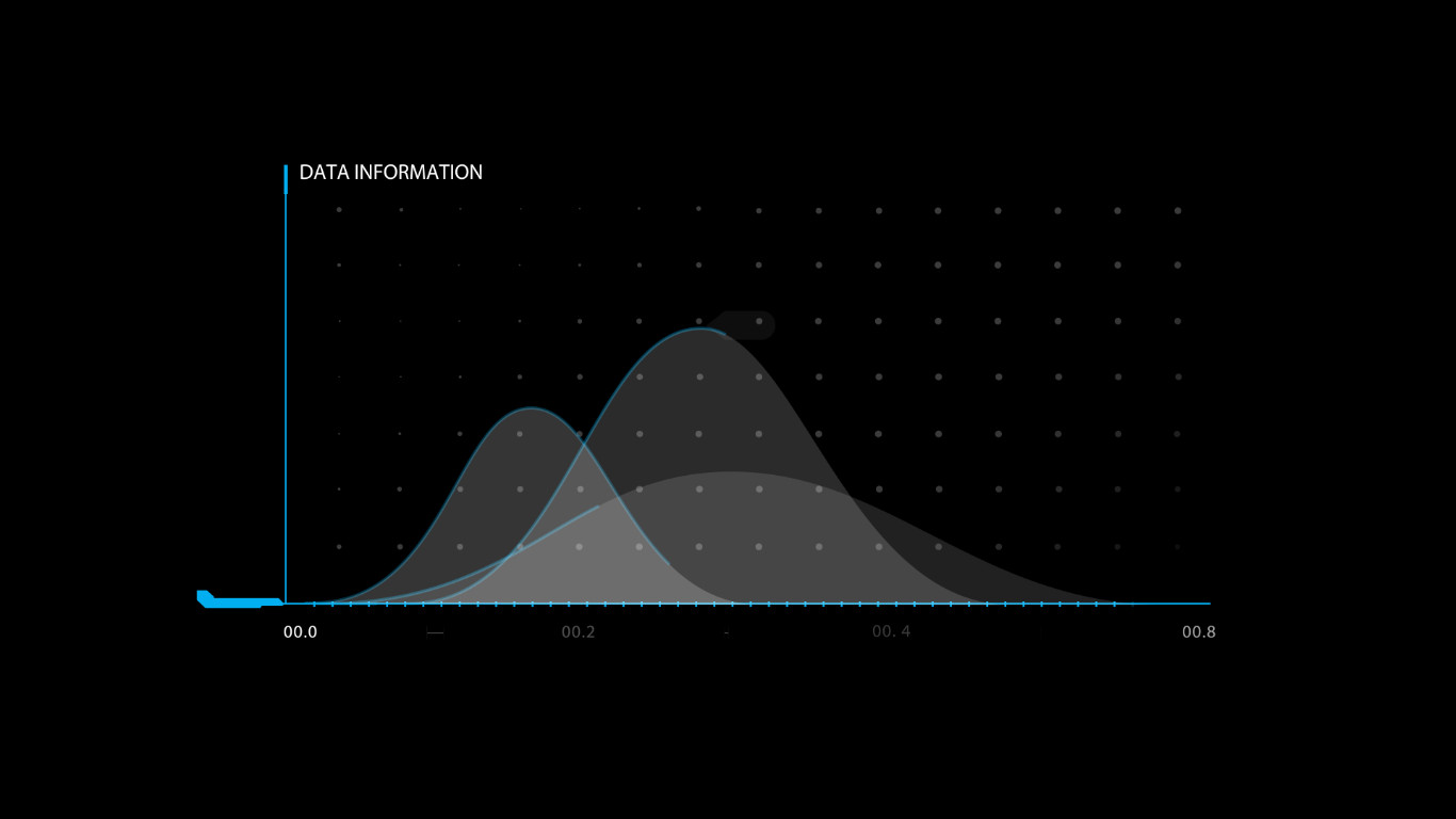
Infographics for Video: Complete Guide to Animated Charts and Graphs
Infographics for video represent the convergence of data visualization and motion design, creating dynamic visual narratives that make complex information accessible and engaging. As video content continues to dominate digital marketing and communication strategies, the ability to create professional animated charts, graphs, and data displays has become an essential skill for content creators, marketers, and educators alike. Explore our collection of background animation stock footage and motion graphics.
Why Infographics for Video
The case for using infographics in video content is backed by compelling data. Audiences retain 95% of a message when consumed via video compared to 10% when reading text. When that video incorporates animated data visualizations, retention rates climb even higher. Motion infographics combine the persuasive power of video storytelling with the authority of data-driven evidence, creating content that is both engaging and credible.
Social media algorithms increasingly prioritize video content, making animated infographics a strategic choice for brands and creators who want to maximize organic reach. Platforms like LinkedIn, Instagram, and TikTok reward video content with higher visibility, and infographic-style videos consistently outperform standard talking-head or text-overlay formats in engagement metrics. A well-produced animated infographic can generate 3-5 times the shares and comments of static alternatives on the same platform.
Animated Chart Types for Video
Different data types and communication goals require different chart formats. Understanding the strengths of each chart type ensures you select the right visual representation for your data:
- Bar Charts — Classic vertical and horizontal bar charts with animated growth effects. Best for comparing quantities across categories. Animated bars rising from baseline create a satisfying visual that clearly communicates magnitude differences
- Pie and Donut Charts — Circular charts that animate segments into place, ideal for showing proportions and percentages. Donut charts offer a cleaner modern aesthetic with space for center labels
- Line Graphs — Continuous line animations that show trends over time. Animated drawing effects reveal the line path incrementally, building suspense and guiding viewers through temporal data stories
- Area Charts — Filled area versions of line graphs that emphasize volume and magnitude. Animated fills transitioning from baseline create dramatic visual impact for market growth and financial data
- Scatter Plots and Bubble Charts — Data point animations that reveal correlations and distributions. Bubble charts add a third dimension through variable sizing, making them ideal for multi-variable analysis
- Number Counters and Data Displays — Animated numerical counters, odometer effects, and data dashboards that emphasize key statistics. These are particularly effective for hero statistics and key performance indicators
Each chart type has optimal use cases. Bar charts excel at categorical comparisons, line graphs at trend analysis, and pie charts at proportion visualization. Professional infographic projects often combine multiple chart types within a single video to present a complete data story.
Best Uses & Applications
Infographics for video serve a wide range of industries and content types. Understanding the most effective applications helps creators target their efforts for maximum impact:
- Marketing and Advertising — Animated infographics in advertising campaigns increase conversion rates by presenting product benefits and market statistics in compelling visual narratives that build trust and credibility
- Financial Services — Investment firms and banks use animated charts to explain market trends, portfolio performance, and economic indicators to clients who may not have financial expertise
- Healthcare and Pharmaceuticals — Medical infographic animations explain treatment outcomes, drug efficacy data, and patient statistics to both professional and consumer audiences in clear, accessible formats
- Education and E-Learning — Educational institutions leverage animated infographics for curriculum delivery in subjects like science, economics, and history that benefit from visual explanation
- Journalism and News Media — News organizations use animated data visualizations to present election results, economic data, and social statistics in formats that general audiences can quickly understand
- Internal Communications — Companies use animated infographics for quarterly reports, strategy presentations, and team updates to communicate performance data clearly and efficiently
Design Guidelines for Video Infographics
Creating effective animated infographics requires adhering to design principles that ensure clarity, readability, and visual impact. Unlike static infographics, video versions must account for the temporal nature of the medium — viewers cannot study a frame indefinitely, so information must be digestible within seconds.
Sequential Reveals — Never present all data at once. Introduce elements one at a time with smooth transitions, giving viewers time to absorb each data point. This builds narrative tension and guides comprehension. A typical reveal sequence is: title, axis labels, data elements, annotations, and conclusion callout.
Typography and Readability — Use large, bold fonts for key numbers and shorter labels. Sans-serif typefaces like Montserrat, Open Sans, or Roboto maintain legibility at all sizes. Avoid text smaller than 24px in a 1080p composition, and test readability on mobile screens where much video content is consumed.
Color Coding — Assign consistent colors to data categories throughout the infographic. Use color to group related information and draw attention to key data points. Ensure color choices accommodate color-blind viewers by combining color with shape or pattern distinctions.
Animation Timing — Motion should feel natural and purposeful. Use ease-in and ease-out keyframes for smooth transitions. Allow 2-3 seconds for each data reveal, with 300-500ms transitions between elements. Consistent pacing creates rhythm that viewers subconsciously anticipate.
Production Workflow
A systematic production workflow ensures consistent quality across infographic video projects:
- Data Preparation — Gather, clean, and verify all data sources. Identify the key narrative and select the most impactful data points. Structure data in spreadsheet format for easy import into animation tools
- Storyboard Creation — Sketch the visual flow of the infographic. Determine chart types, reveal sequences, and transition points between scenes. A storyboard serves as the blueprint for the entire production
- Asset Design — Create chart elements, icons, backgrounds, and typography in vector format. Use Adobe Illustrator for precision and scalability. Export with organized layer naming for efficient animation
- Animation in After Effects — Import assets and build the timeline. Apply trim paths for chart growth, opacity fades for reveals, and position animations for movement. Use expressions for automated data-driven animations where possible
- Audio Integration — Add background music that matches the infographic's energy and pacing. Use sound effects for data reveals and transitions. Consider voiceover narration for complex data that benefits from verbal explanation
- Review and Export — Preview the full animation to verify timing, legibility, and data accuracy. Export at target resolution using appropriate codecs. Create multiple format versions for different distribution platforms
Technical Specifications
| Resolution & Format | |
|---|---|
| Resolution | 3840 x 2160 (4K UHD) / 1920 x 1080 (Full HD) |
| Frame Rate | 23.976, 29.97, or 30 fps |
| Codec | H.264, H.265 (HEVC), ProRes 422 |
| Color Space | Rec. 709, sRGB |
| File Format | MP4, MOV, GIF for lightweight sharing |
| Animation Parameters | |
|---|---|
| Chart Reveal Time | 2-3 seconds per element |
| Transition Duration | 300-500 milliseconds |
| Scene Duration | 15-30 seconds per data view |
| Total Duration | 30-120 seconds per infographic |
| Compatibility | |
|---|---|
| Software | After Effects, Premiere Pro, Final Cut Pro, DaVinci Resolve |
| Usage | Broadcast, web, social media, presentation, e-learning |
| Licensing | Royalty-free standard license |
Pros
- Dramatically improves information retention
- Versatile across industries and platforms
- Sequential reveals guide viewer comprehension
- Professional quality builds brand authority
- High shareability on social media platforms
Cons
- Production requires motion design expertise
- Complex charts increase render times
- Data updates require full re-render
- File sizes significantly larger than static graphics
Verdict
Infographics for video represent a powerful evolution in data communication, combining the authority of data-driven evidence with the engagement of motion design. When produced with attention to chart selection, design principles, and animation pacing, animated infographics deliver superior results across marketing, education, corporate communications, and journalism. SPurno Animation Studio's library of animated chart templates and infographic assets provides creators with professional tools to produce compelling data visualizations efficiently. Browse our collection to elevate your next video project with polished, data-driven motion graphics.